Logo
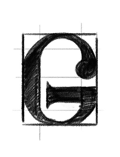
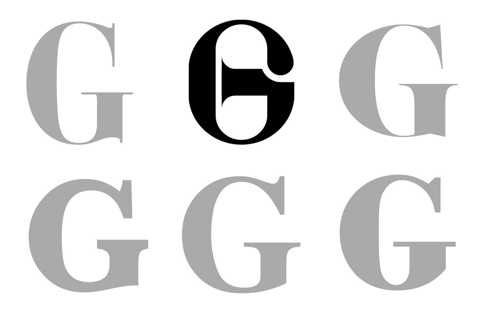
The letter G is interesting in many ways. It has an elegant curve that can be exploited in various forms. Its lower loop and the horizontal bar in the uppercase variations offer possibilities for ornamentation and personalization, allowing us to play between thick and thin strokes.
Beyond its retro and colorful aesthetic, Goldtimer is above all an ode to nostalgia, a tribute to the automotive oldtimers and masterpieces that have captivated enthusiasts. In short, a mission: to perpetuate excellence through art.
Due to its distinctive and elegant character, Didone-style lettering is the most representative and fitting choice. We refined its upper serif into a teardrop shape to maintain dynamism and softness in the logo, while ensuring a mechanical, strict and serious balance with this thick horizontal stroke.


Blazon + Crown
Excellence, luxury, know-how
Final
Print
Porsche 911 BB Turbo Targa
40x50cm poster
40x50cm poster
Jaguar Type E
40x50cm poster
40x50cm poster
Alpine A110 1300
40x50cm poster
40x50cm poster
Porsche 911 2.0 S
40x50cm poster
40x50cm poster
