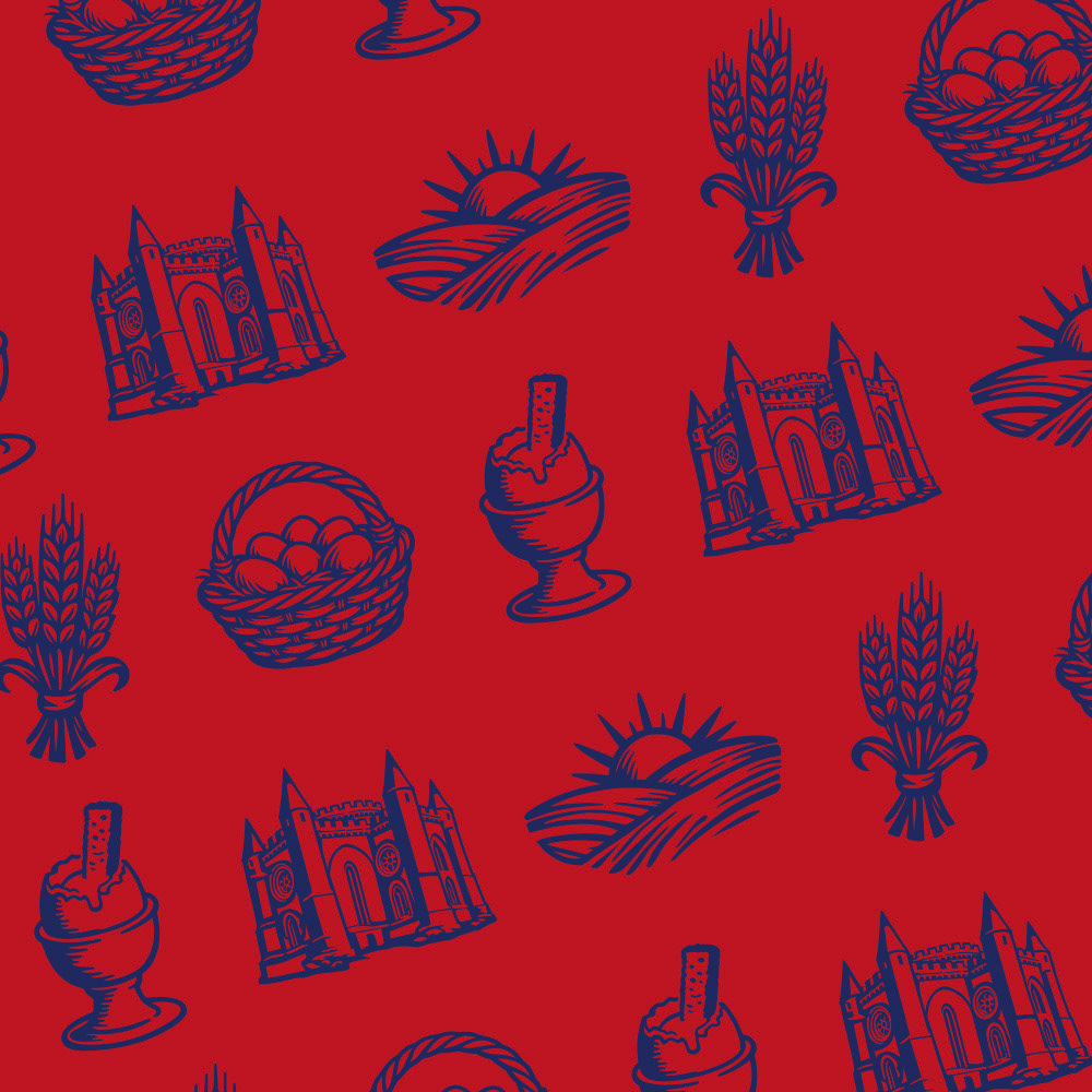
Pattern
La Galina’s visual identity relies on a set of illustrated, repeating motifs. These elements provide a clear and cohesive brand narrative, telling the complete story from "farm to table": origin, production, and consumption.
Each icon is intentionally stylized within a unified visual language (clean lines, flat colors, and a vintage feel), making them versatile enough to be used individually, as a border, or as a repeating pattern on socials content or packaging.
Tiller Bold
ABCDEFGHIJKLMNOPQRSTUVWXYZ
abcdefghijklmnopqrstuvwxyz
0123456789
!”#%&’()*+,-./:;?@[]_{}«·»
ABCDEFGHIJKLMNOPQRSTUVWXYZ
abcdefghijklmnopqrstuvwxyz
0123456789
!”#%&’()*+,-./:;?@[]_{}«·»
Puffin Display Regular
ABCDEFGHIJKLMNOPQRSTUVWXYZ
abcdefghijklmnopqrstuvwxyz
0123456789 !”#%&’()*+,-./:;?@[]_{}«·»
ABCDEFGHIJKLMNOPQRSTUVWXYZ
abcdefghijklmnopqrstuvwxyz
0123456789 !”#%&’()*+,-./:;?@[]_{}«·»
Typography
The typography centers on a simple, cohesive font pairing that scales effortlessly across all assets, ensuring clean readability while bringing out the brand's distinct character.
Tiller Bold handles headlines and callouts. Its commanding, editorial presence anchors the layout and gives visual punch to the copy. Puffin Display Regular is the workhorse for body copy—handling paragraphs, product descriptions, and secondary details. Its neutral, highly legible design keeps information clear while staying perfectly in sync with the overall look.
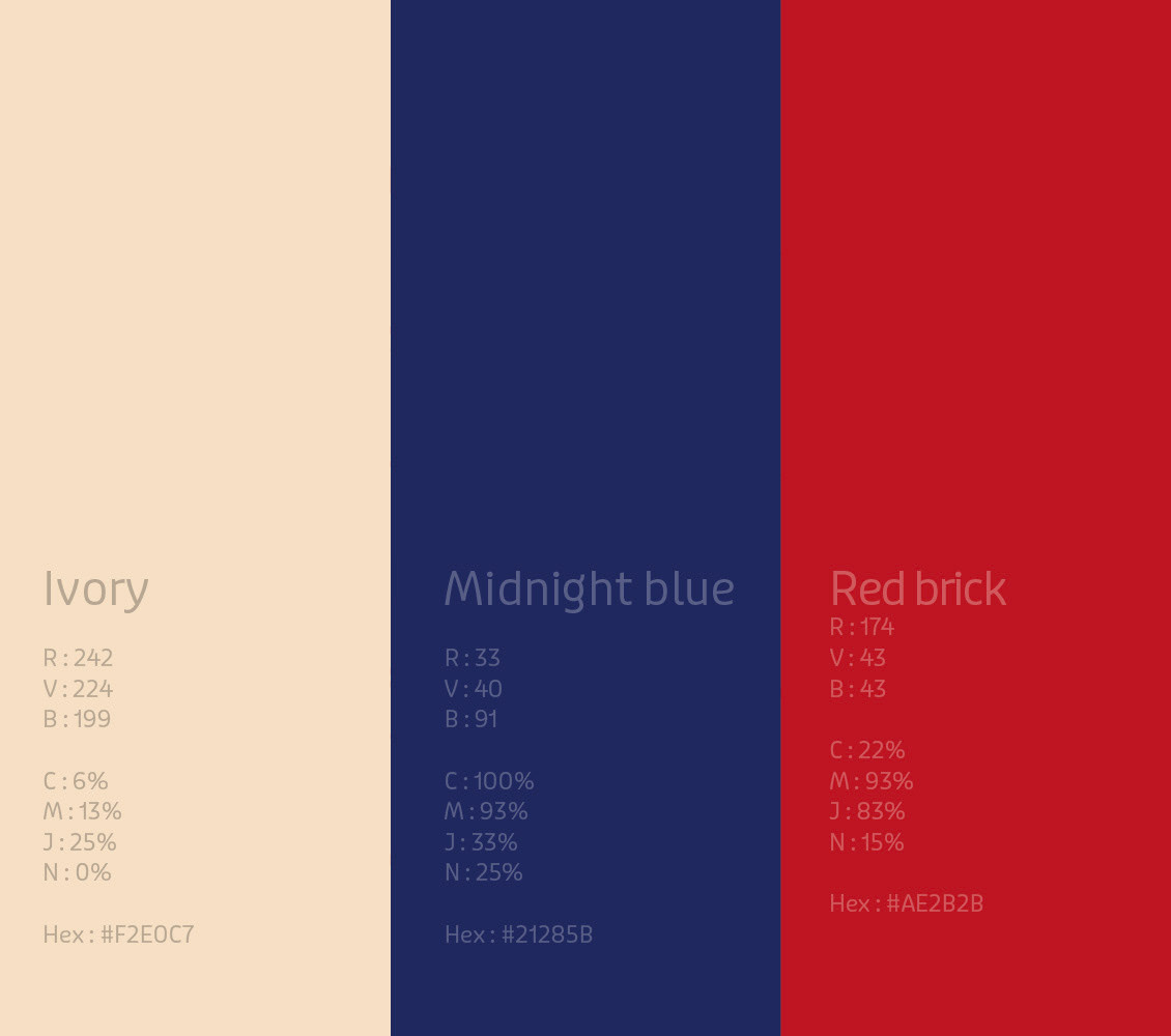
Colors
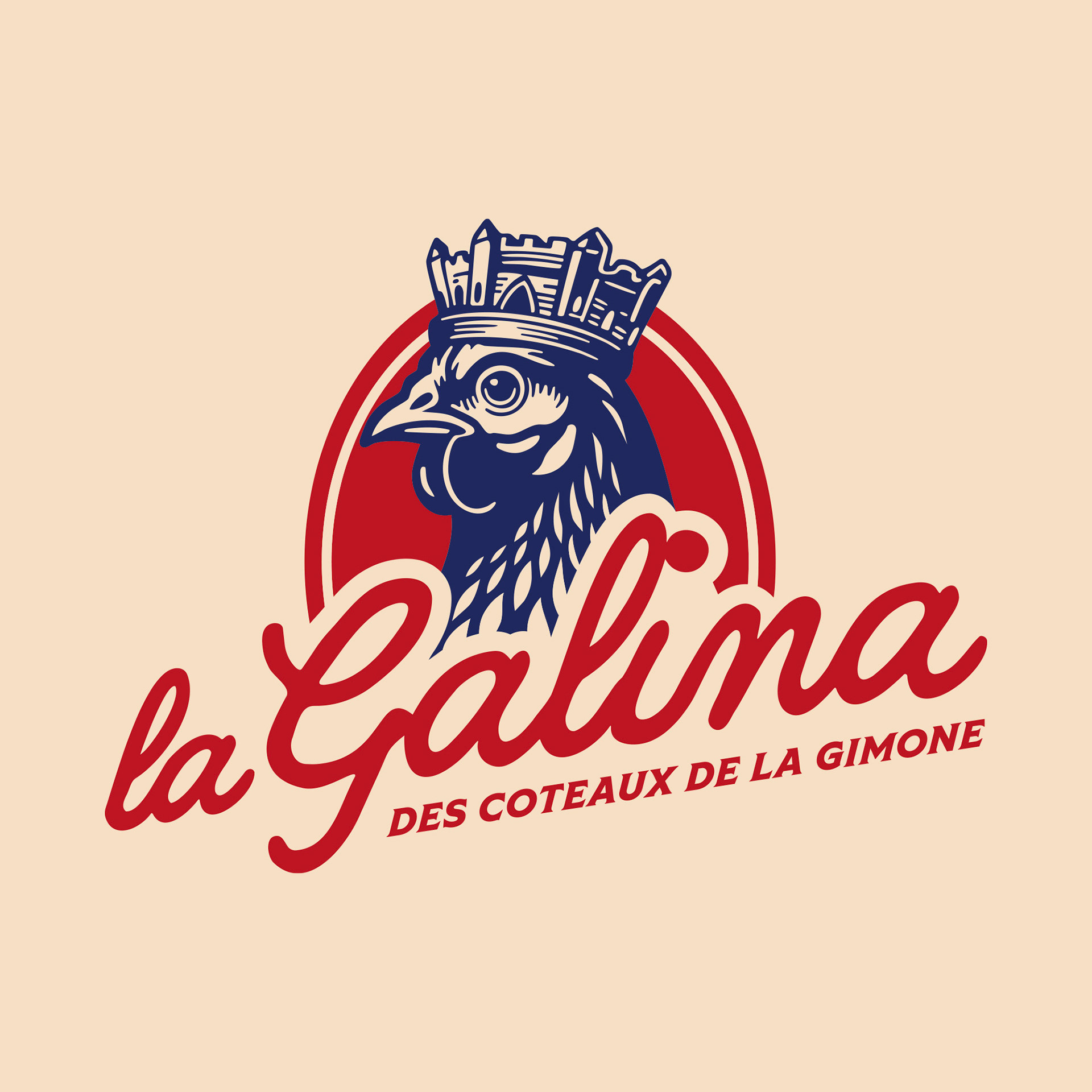
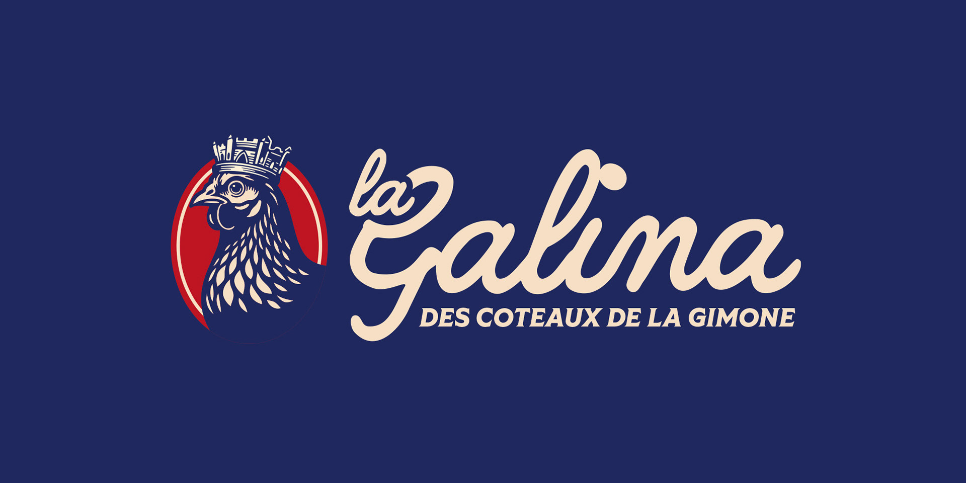
La Galina’s palette centers on a high-contrast deep blue and red pairing inspired by the coat of arms of Simorre—the village where the farm is located. This choice naturally channels the brand's French heritage while commanding strong shelf presence and sharp legibility.
A soft cream tone completes the foundation. Mirroring the color of eggshells, it adds a warm, vintage texture to backgrounds and packaging, avoiding the sterile look of standard white. The result is a bold, traditional identity that scales effortlessly across print and digital.
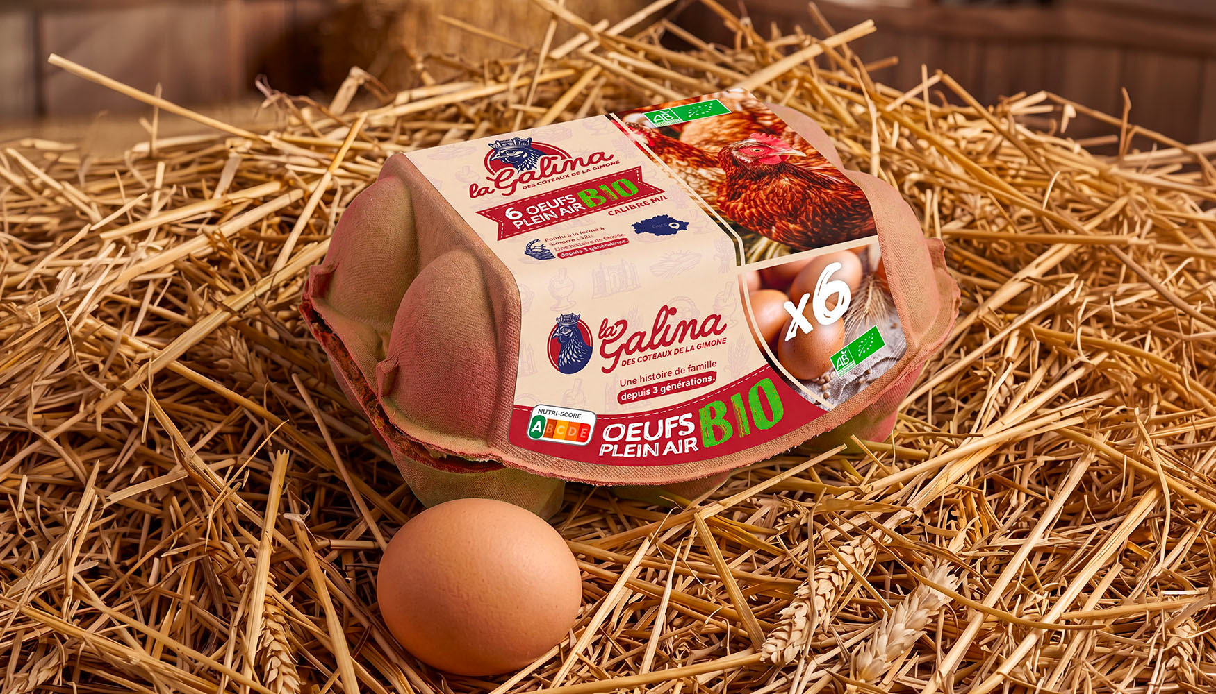
Packaging